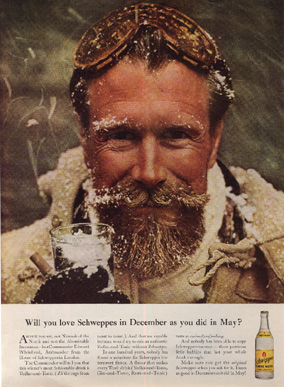
Schweppes was my favorite campaign to work on. Commander Edward Whitehead was a former Royal Navy officer from World War II who had come to the U.S. in the 1950s to run Schweppes's American distribution. Ogilvy thought Whitehead could be a great imagemaker for Schweppes. It's quite common, of course, for ad agencies to feature a company's chief executive in their advertisements - it's the kind of flattery by which everybody wins. And Ogilvy was very successful at using "icons" - charismatic individuals who would represent a brand - as with the guy with the eye patch for Hathaway shirts. But this was different.
To the left: Richard Avedon took this picture of Whitehead on a roof in New York City. It really was snowing.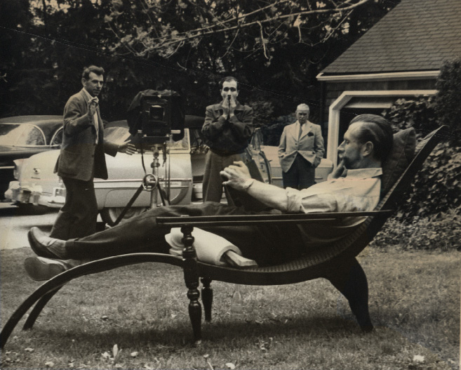
Teddy Whitehead, with his military bearing and his distinctive beard, had just the right appearance, and he was great fun to work with because he'd give himself up to any scenario we'd devise - we had Whitehead in dozens of situations, including rockclimbing - decades before this sport became such a trademark of advertisers! We really hit it off. Right from the start, much of the Schweppes campaign was devised by copywriter Riva Fine and me. Evolving these Whitehead situations became a great joy for us.
To the left: Teddy Whitehead lounging for the camera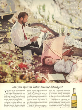
Can you spot the Yellow-Breasted Schweppes? This ad is one of my all time favorites. It's a great picture, and I love the way the headline ties in with the image. Showing the Schweppes bottles - ostensibly the key to the ad - so subtly and out of focus was clearly a novel idea. The layout itself is typical of the style that brought the agency into a position of prominence - with the picture occupying 60% or more of the space, and simple copy in three block below the headline.
Can you spot the Yellow-Breasted Schweppes? This ad is one of my all time favorites. It's a great picture, and I love the way the headline ties in with the image. Showing the Schweppes bottles - ostensibly the key to the ad - so subtly and out of focus was clearly a novel idea. The layout itself is typical of the style that brought the agency into a position of prominence - with the picture occupying 60% or more of the space, and simple copy in three block below the headline.