|
|
|
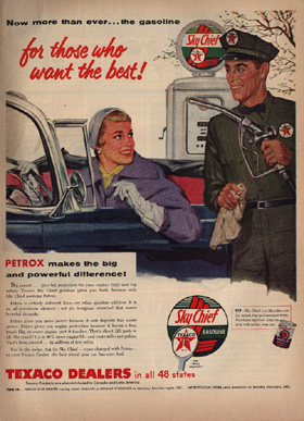
An example of the
kind of ads that were prevelant in that era. |
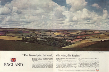
A nice Ogilvy ad. Notice the
clean, simple copy blocks. |
| Advertising in the 1950s | Schweppes Ads | Renderings & Ads | Puerto Rico Ads | The Ogilvy Style | Ad Campaign Work | Bill Binzen Home |
|
|
|
|
An example of the
kind of ads that were prevelant in that era. |
A nice Ogilvy ad. Notice the
clean, simple copy blocks. |
|
The basic format Ogilvy developed was his advertising road to glory: a beautiful picture would take up about 60% or more of the ad space. Beneath it would be a short headline, something that would catch your eye, something easy to read, that would make you want to read on. Beneath the headline would be three neatly lined-up copy blocks. I became a part of the successful promotion of this format. It was designed to make an impact, and it was almost inevitable that it would. For a few glorious years, we got very interesting accounts and terrific notice for it. |
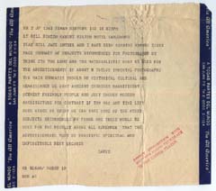 |
Often we would get memos from Ogilvy, who really watched everything that went on very closely. That close attention and rapport partly accounts for the great success of the agency that he built. Here's an amusing memo I received from Ogilvy while I was away on assignment on our first campaign for the Commonwealth of Puerto Rico. It really shows the way he communicated his vision. It says: What we need for the advertisements is about twelve immortal photographs. The emphasis should be historical, cultural, and renaissance. We want ancient churches, magnificent scenery, friendly people, and just enough modern architecture for contrast. Remember that the advertisements must be beautiful, spiritual, and unforgettable. Best regards. David. How's that for an assignment! |
|
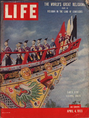
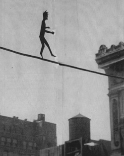
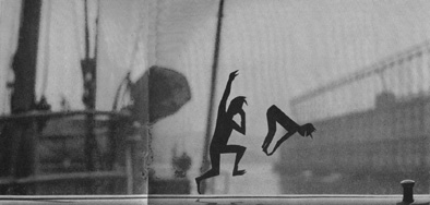
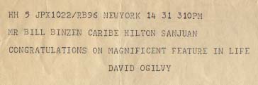
In 1955, I had independently sent some of my own artworks to Life magazine. They were cutout sillhouettes placed in natural settings, and Life ran some of them in their "Speaking of Pictures" section one week while I was working in Puerto Rico. This really wowed them back at the agency. Here's a cable David sent me, showing what a thoughtful kind of guy he was. It says "Congratulations on magnificent feature in Life." | |
 |
 |
|
 |
||
Next: Ad campaign work
| Advertising in the 1950s | Schweppes Ads | Renderings & Ads | Puerto Rico Ads | The Ogilvy Style | Ad Campaign Work | Bill Binzen Home |